When you search for seating plan wedding ideas, start with the moment a guest looks for their name. A beautiful display should make that moment feel welcoming and straightforward. Choose the lookup method first, then give it the colors, textures, and personal details that belong at your reception. The decoration can be expressive while the assignment stays clear.
Here are five useful directions to explore: a single readable board, a set of framed lists, a tabletop escort-card arrangement, a mirror display, and colorful grouped panels. Each offers a different way to present the same information. This guide focuses on the display guests use to find a table, with practical ways to adapt the design and check a sample before committing to the finished piece.
Read Seating Plan Inspiration Through a Guest’s Eyes
Seating-chart inspiration includes restrained typography, decorative frames, illustrated motifs, sculptural objects, and interactive displays. The range lets you choose how much visual attention the seating moment should receive. It does not mean that a more elaborate installation will serve your guests better. Treat the image you save as a design reference, then ask how a person would actually use your version.
A reference photograph may show the structure and flowers beautifully without revealing whether a name is readable. It may also hide how the display looks once cards have been collected. When reviewing an idea, separate the permanent decoration from the information guests need. That distinction lets you preserve the appealing detail while changing the parts that would make your own display harder to use.
Know what information the display must deliver
Woman Getting Married’s seating-card guide distinguishes three familiar formats: an escort card directs a guest to a table, a place card identifies a particular seat, and a seating chart presents assignments together. Choose the format according to what your guests need to know before entering the dining area. You can combine a chart with place cards when you also want assigned seats.
For a table assignment, the basic answer is a recognizable guest name and a table identifier. Keep those two details together visually. If you use a decorative table name, make sure the matching table sign uses the same wording. A playful name can be part of the celebration; the guest should still be able to recognize the destination without needing an explanation of the theme.
An alphabetical list is a useful starting proposal because a guest already knows their name. A list grouped by table can show companions together, but it asks the guest to locate their name among several table groups. Compare both with a realistic sample of your own names. Choose the arrangement you can make easiest to search, rather than copying the organization of an inspiration photograph automatically.
Give the decorative details a clear job
Decide which detail carries the personality. It might be an illustrated border, the shape of a frame, a color repeated from the invitation, or the material around a printed list. Then let the guest names remain visually calm. You can use expressive lettering in the heading while choosing a simpler treatment for the information people have to read.
Ask your planner or venue contact where the display can stand and how guests will approach it. A broad wall and a small entrance table offer different opportunities. Take an idea to that conversation before commissioning the structure. If you are still deciding the dining format or room arrangement, the guide to wedding reception layout and flow covers that separate planning question.
Choose a Display Format That Suits the Information
Use these five seating plan wedding ideas as starting designs, not fixed recipes. The right choice depends on how much information you need to show, where it will be displayed, and how you want to handle revisions. Make a small sample of the actual text before deciding that a decorative format fits. That sample can reveal a mismatch while the design is still easy to change.
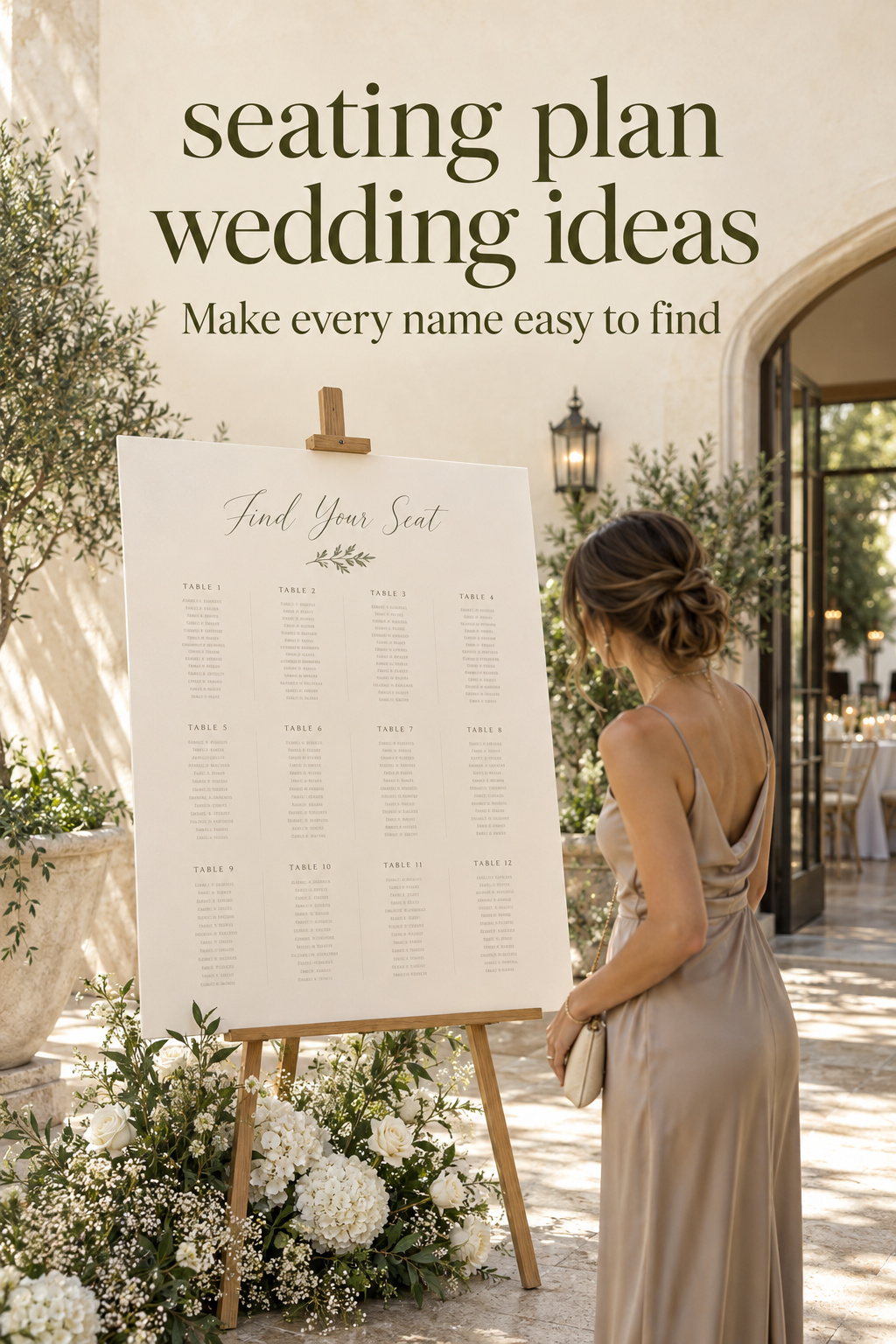
1. A single board with a restrained border
Choose a single board when you want one recognizable place to look. An ivory background, a dark text color, and a slim border can provide a quiet design that works beside more expressive flowers or reception styling. Repeat a motif from your stationery in the border or heading, leaving the name columns free of decoration. The result can feel intentional without requiring a separate object for every guest.
Build the layout around your longest names and the fullest part of the list. If the text starts to feel crowded, explore a larger readable layout or a second coordinated panel before shrinking everything. Ask the stationer or printer to show the proof at its intended scale. A board that looks balanced on a laptop may need different spacing when viewed at the entrance.
The main revision question is how the final list will be produced. Before ordering, ask what edits are possible and when the supplier needs approved information. Keep a current working assignment list separate from the decorative file. If a detail changes after production, agree on a presentable correction with the person making the board rather than quietly improvising a conflicting second list.
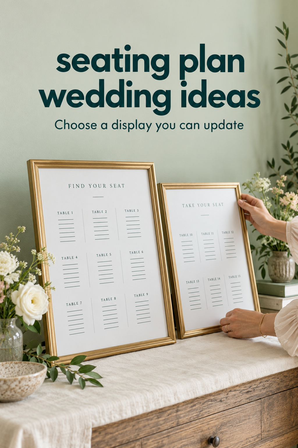
2. Framed lists with replaceable inserts
Use several frames when you like a collected or gallery-like appearance. Coordinate the paper and type treatment even if the frame shapes differ. Keep the reading sequence obvious: arrange the groups in an order someone can follow without jumping around. With alphabetical sections, use clear letter ranges and choose them according to your actual list, rather than dividing the alphabet into visually equal parts by default.
For example, one section may contain many more names than another. Make room for that difference in the layout. You can adjust the ranges, the panel arrangement, or the amount of paper devoted to each group. The aim is a coherent search route, not perfect visual symmetry. If you prefer lists by table, make the table identifiers more prominent than the frame decoration.
Printed inserts offer a way to explore individual replacements, provided the frame can be opened and the paper can be reproduced consistently. Test that process before relying on it. Check how the display looks with all frames together and whether anything casts a shadow over the names. A sample frame is useful, but it does not reveal the full reading order on its own.
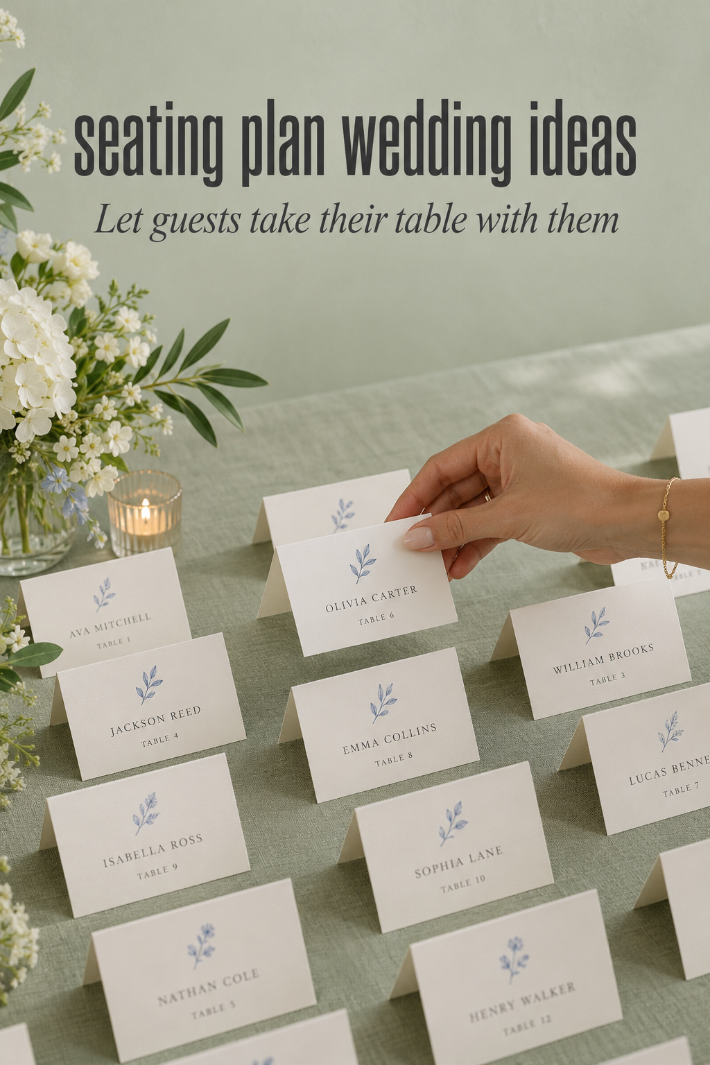
3. Escort cards on a carefully styled table
A tabletop card display gives each guest an individual assignment to carry. Use a consistent card face with the name and table together. Arrange the cards in a clear order and let the styling frame that order. A small floral arrangement at one end or a fabric color beneath the cards can supply the design character without placing objects between every name.
Make an arrangement with sample cards and physically lift a few out. Can another guest still find the next card without moving a centerpiece or touching several neighbors? Does a card keep its table information when it is taken away? These are useful questions to answer while developing the display. Do not judge the arrangement only from the photograph taken before anyone uses it.
If you like the idea of combining a favor with an escort card, first decide whether the object genuinely earns its place. Make the assignment readable without turning or opening the favor. Give guests a straightforward way to receive their table information even if they do not want the object. You can keep the personal gesture while avoiding a seating process that depends on participation.
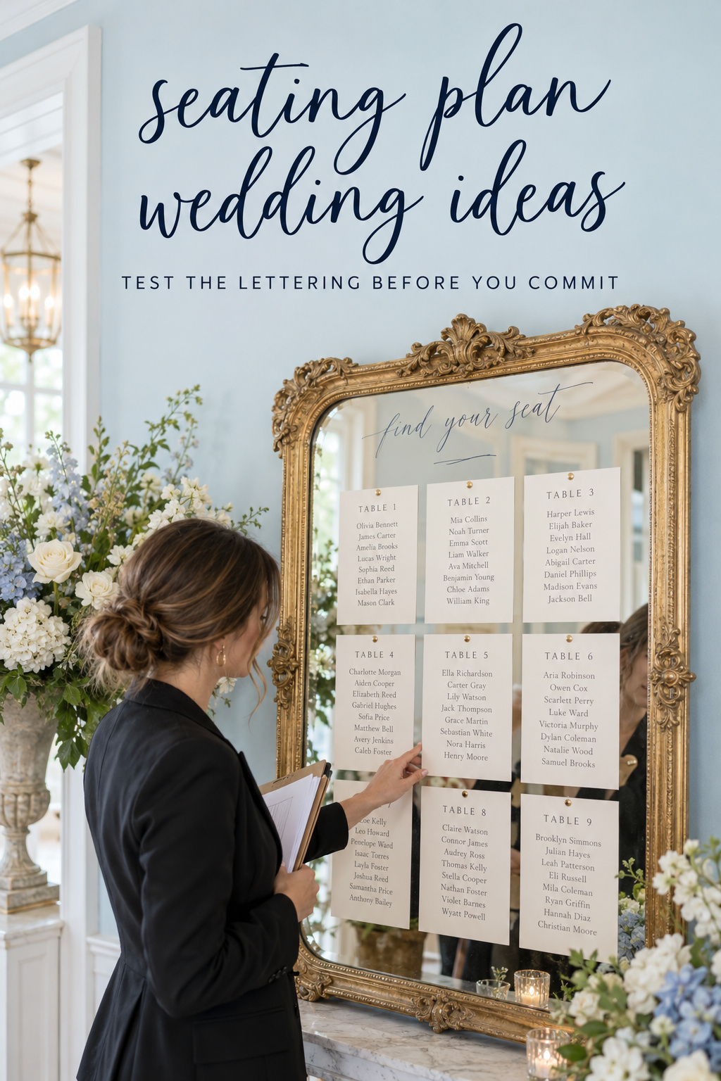
4. A mirror with clearly separated information
A mirror can contribute a decorative focal point, especially when its frame echoes other reception details. Begin with a short sample of the intended lettering and view it in the proposed setting. Look at what is reflected behind the words and whether the contrast remains usable as you change position. Let that check guide the design instead of assuming the surface will behave like plain paper.
You can explore attaching printed cards or a readable inset to the mirror structure rather than writing every assignment directly on the reflective area. This keeps the frame as the visual feature while giving the text a calmer background. The choice depends on the look you want and the way the maker can produce it. Ask to see the proposed attachment and correction approach.
Confirm where the piece will be positioned and who is responsible for installing it. The venue or supplier should approve the actual setup. Keep nearby flowers or decorative objects away from the information area in your mockup. If the mirror format demands lettering too small to use comfortably, preserve the frame idea in another part of the wedding and choose a different seating display.
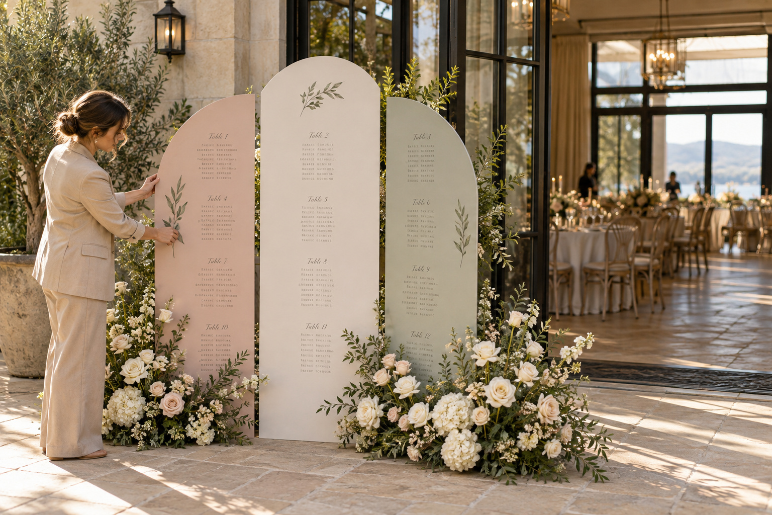
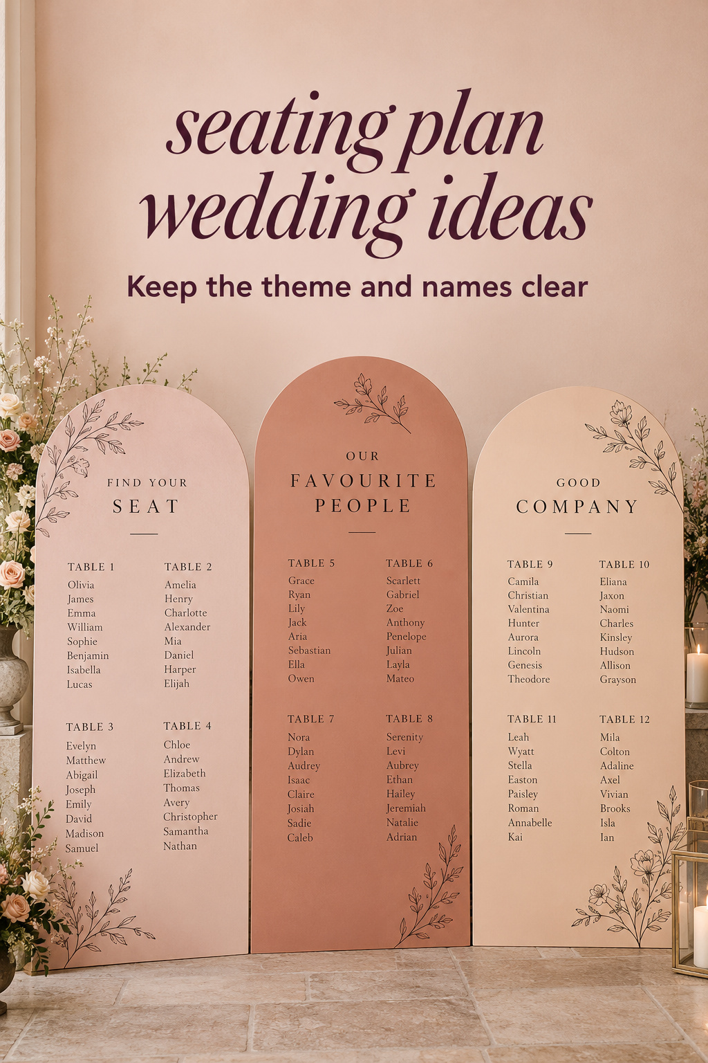
5. Colorful panels with a clear name sequence
A set of colored panels can create a strong visual statement without adding an object for each guest. Use color in the backgrounds, borders, or panel shapes, then give each section an obvious label. If you choose alphabetical groups, the labels should explain where a name belongs. Guests should not have to infer which panel to search from a color theme alone.
A personal illustration can sit beside each panel heading: a line drawing, a small floral motif, or a shape from the invitation. Keep it separate from the name rows. When you compare color combinations, print or produce a text sample on the intended background. Judge the guest information in that sample, not just the appeal of the palette in a mood board.
Plan how the panels relate to one another as a complete display. A guest needs to see the sequence before reading individual entries. Ask the maker whether the sections can be revised independently and what the replacement would look like. That question is especially useful when different panels have different shapes or finishes, since a correction should remain recognizably part of the same design.
Make the Design Personal Without Hiding the Assignment
Personalization works best when it gives the display a visual story while leaving the search method familiar. Choose one detail that matters to you and carry it through the heading, border, or matching table signs. You do not need a different novelty for every guest. The seating display can feel connected to the wedding through a few considered choices.
A garden interpretation with a quiet information area
Imagine a garden-inspired reception with botanical stationery. A useful interpretation could use an illustrated leafy edge around a plain name list and a small arrangement beside the stand. The actual guest information stays on the calm center of the board. The botanical detail provides continuity, while the list avoids competing with flower stems or layered decorative paper.
If you want individual cards instead, use the same botanical mark on a corner of each card. Give the name and table room to stand apart from it. Test the display with some cards already removed, since the floral styling should still look intentional after guests collect assignments. This is an illustrative design exercise, not a rule that a garden wedding needs botanical signage.
A travel interpretation with matching destinations
For a couple who enjoys travel, a small map detail or destination illustration can frame the display. You might give each dining table a place name, but decide how a guest will identify that table in the room. One option is to pair the personal name with a simple number, such as “Table 4: Harbor.” Use the same pairing on the assignment and the table sign.
Keep each person’s name searchable in the main display. A map can be decorative context without becoming the only way to locate the assignment. If you want the map to convey a real route through the reception space, work from the actual layout and confirm that the graphic matches it. Otherwise, let the map express the theme and use explicit labels for navigation.
A graphic interpretation built around typography
A graphic direction can use one accent color, a confident heading, and neatly arranged sections. Let the hierarchy carry the design: title first, section label second, guest name and destination together. Small geometric details can give the display personality without adding a layer guests need to decode. Repeat the accent on table-number signs if that supports the overall reception styling.
This approach is useful to consider when you like colorful inspiration but want a simple build. Start with the text structure and add the visual treatment afterward. If you already organize your ideas in a resource such as The Wedding Command Center, keep the chosen display concept beside the questions you want to discuss with your planner or stationer. Use it to clarify the design conversation, without assuming it replaces the actual assignment list.
Keep the Useful Details When the Display Is Finished
Before approving the final design, test a realistic part of the guest journey. This is a suggested planning exercise rather than a claim that the concepts have been professionally tested. Ask someone who did not design the sample to find a few names and identify their tables. Give them the display as it will appear, without explaining the organization first.
Check a real-scale sample
Include a long name, similar surnames, and an entry near the edge or bottom of the layout. View the sample from the position where a guest would normally approach it. Ask what they noticed first and whether they understood which section to search. If they need a verbal explanation, simplify the labels or the sequence before adding more decoration.
Also compare the name-list sample with the matching table sign. Can the person move from one to the other using the information provided? A beautiful table name that appears differently on the chart and table creates a preventable ambiguity. Keep the spelling and identifiers consistent across the pieces, even when the visual designs have different proportions.
Discuss the reading and waiting area with your planner or venue team. Ask whether guests can pause at the display without blocking the intended route into the reception. If you propose multiple displays, make clear whether they repeat the complete information or show different sections. Someone approaching a second copy should not wonder whether it contains a different set of assignments.
Choose how corrections will be handled
Agree with the maker on when you will provide the approved list and what can still be changed afterward. Follow their actual production instructions rather than a generic online printing timeline. Review spelling and assignments against your current guest record before approval. A design proof is a good place to inspect the final text, not an invitation to create another unofficial set of table decisions.
Keep a plain current assignment list available to the person helping guests. It can support a name that was missed, a card that cannot be found, or a question about the table label. Decide who will answer these questions. The decorative display remains the welcome piece, while the helper has a straightforward reference if someone needs assistance.
Give the display its own setup note: intended location, panel order if relevant, matching table signs, and the person who knows the approved list. Keep this note short enough to use. For the wider delivery and packing questions, the guide to tracking wedding-day items covers how an object gets to its place and returns afterward.
The lasting choice is a design you like and a search method guests can understand. Preserve the feature that makes the display feel like your wedding, whether that is a frame, a color, or a personal illustration. Then remove anything that makes the name and destination harder to find. A simple design can be expressive, and an elaborate one can still be clear when the information has room to work.
Sources and Methodology
The terminology above follows the linked Woman Getting Married guide. One Fab Day’s table-plan collection provides additional context on familiar display formats and the importance of readability. Research also reviewed editorial galleries, inspiration boards, a product catalogue, and an anecdotal discussion to distinguish visual inspiration from practical instructions. The design adaptations and sample checks here are original editorial suggestions; no market-popularity ranking, universal dimensions, or personal testing claims are made.
FAQ
What are some seating plan wedding ideas that are easy to understand?
Start with a plainly organized board, framed lists, or ordered escort cards. You can add personality through a border, color, illustration, or frame while keeping names and table identifiers clear. Choose the format after trying a realistic text sample.
Should a wedding seating chart be alphabetical or grouped by table?
An alphabetical list gives guests a familiar starting point: their name. A table-grouped list shows companions together but asks guests to search across groups. Compare realistic samples and choose the organization you can label and present most clearly.
What is the difference between escort cards and place cards?
Escort cards direct guests to their assigned tables. Place cards identify individual seats at those tables. A seating chart presents assignments in one display and can be combined with place cards when you also want assigned seats.
How can we personalize a seating plan without making it confusing?
Use a meaningful motif, color, or frame around the information. Keep names easy to search and repeat table names or numbers consistently on the matching table signs. Let the theme add character without becoming a puzzle guests need to solve.
Is a mirror a good choice for a wedding seating chart?
It can be, if the text is readable in the actual setting and the installation is approved by the venue or supplier. Try a lettering sample and inspect reflections from different positions. A printed inset is another way to retain the frame while simplifying the information area.
How big should the seating chart be?
Choose the size using the actual list, reading distance, display location, and a real-scale proof. If names feel crowded, explore another panel or a different format rather than assuming one standard size works for every wedding. Ask the maker to help assess the sample.
How do we handle a seating change after the display is made?
Use the correction method agreed with the maker and update the current assignment reference held by your helper. Keep the guest-facing display and supporting list consistent. Ask about revision options before ordering, especially when text is written directly onto a decorative surface.
Leave a Reply