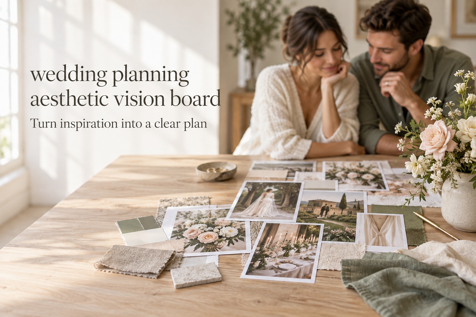
A wedding planning aesthetic vision board should do more than prove that you have excellent taste. At its best, it helps the two of you make decisions before every floral stem, menu card, and rental option becomes a separate debate. The goal is not to make a perfectly polished collage. It is to create a small visual brief that captures how the celebration should feel, what details carry that feeling, and what does not belong.
Think of the board as a bridge between instinct and execution. You may know that you want the day to feel warm, quietly celebratory, and a little cinematic. Your florist, stationer, planner, photographer, and venue coordinator need more than those words. They need examples and priorities. A focused board gives them a starting point while keeping you from being pulled in a new direction every time you see another beautiful idea online.
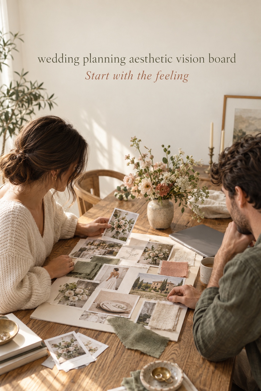
Start with the feeling, not a color palette
Before opening Pinterest or saving a single image, sit down together and name the experience you want to create. Not the theme. Not a list of objects. Start with three feeling words. For example: intimate, sun-washed, and generous. Or: tailored, lively, and low-lit. Words like these are useful because they can guide choices that do not look alike at first glance. A tapered candle, a handwritten place card, and a long shared table may all support an intimate feeling. A random trend may be lovely yet not support it at all.
Then add two practical constraints. You may be working with a historic venue whose architecture is already visually strong. You may be hosting outdoors where the light changes quickly. You may care most about an easy guest experience, a family tradition, or a dinner that lasts long enough for real conversation. Constraints do not make a vision less romantic. They make it more personal and more achievable.
This is also the moment to name a few clear noes. Perhaps neither of you wants a ballroom to feel overly formal, a garden dinner to feel rustic, or a modern space to become cold. A board without boundaries becomes a storage place for everything you like. A board with boundaries becomes a decision tool. WeddingWire similarly suggests looking at your everyday home and wardrobe preferences, rather than adopting an aesthetic that only feels appealing on a screen. Their guide to choosing a wedding aesthetic is a useful prompt for that conversation.
- Write three feeling words that describe the guest experience.
- Write two real-world constraints, such as venue, season, budget, or guest comfort.
- Write three things that are beautiful but not right for your day.
Keep this short statement at the top of the board. It gives you a way to test later choices. When you are choosing between two linen colors or deciding whether to add a lounge area, ask which option supports the statement. You do not need unanimous excitement about every object. You need a coherent reason for the decisions that shape the room.
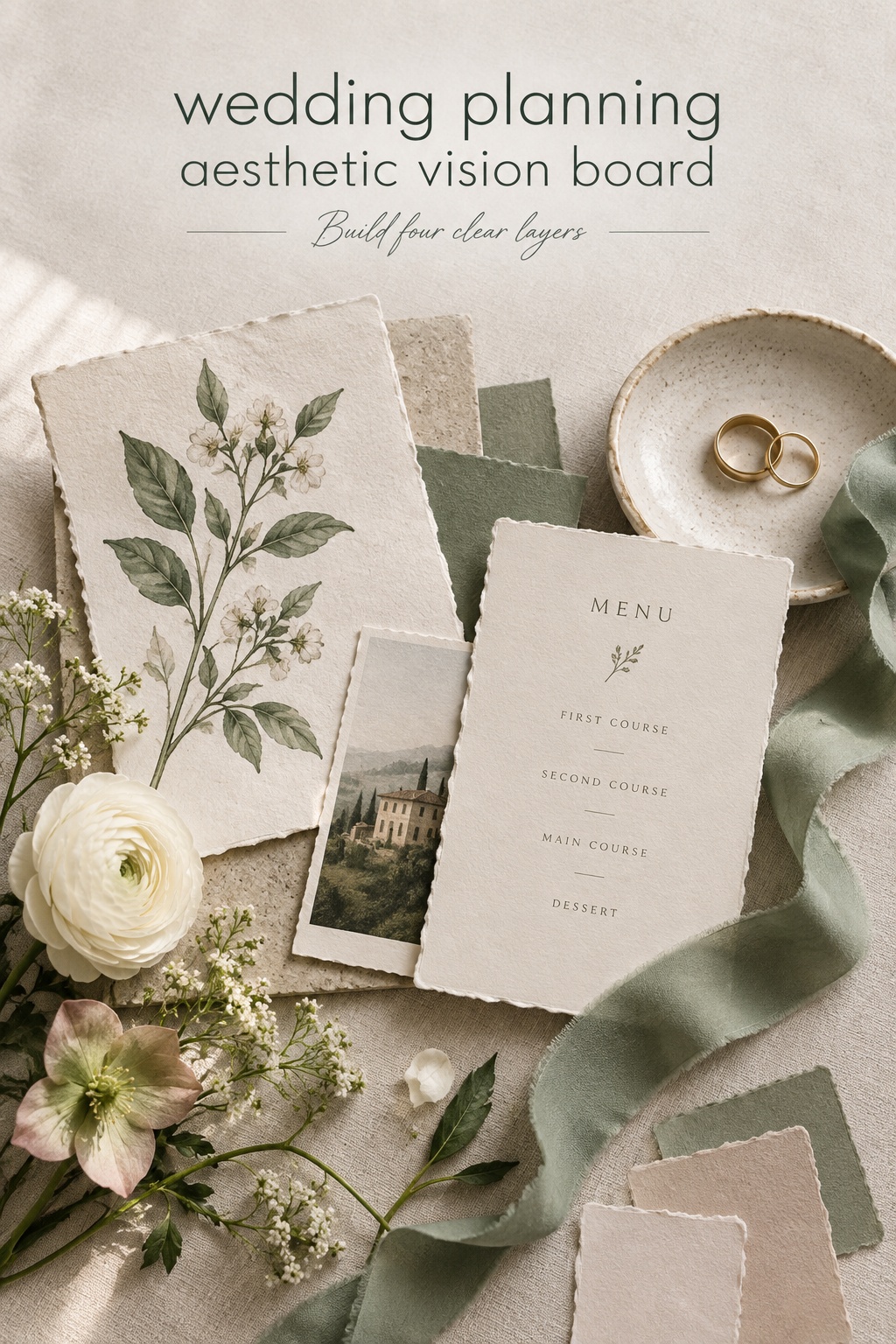
Build the board in four connected layers
A single stream of saved images can be inspiring, but it is hard to use in a planning meeting. Build your wedding planning aesthetic vision board in four layers instead. Each layer answers a different question, and together they keep the final look from becoming a collection of unrelated pretty things.
Layer one: atmosphere
Atmosphere is the first impression. Include images of light, scale, setting, movement, and emotional energy. These do not have to be wedding images. A restaurant at dusk, a favorite hotel lobby, the particular shade of sky on a memorable trip, or a film still can say more than another photograph of centerpieces. The Knot notes that mood boards can combine wedding and non-wedding references, including architecture, texture, typography, and settings. Its mood-board guide is especially helpful for widening the search beyond wedding galleries.
Choose only a few atmosphere images. If every image is a close-up, the board will not communicate the scale of the day. If every image is a wide venue shot, it will not communicate intimacy. Aim for a balanced set: one or two location references, one image for lighting, one for the pace of the celebration, and one that simply makes both of you say, “That feels like us.”
Layer two: materials and visual language
Now look closer. This layer includes color relationships, texture, shape, typography, floral movement, and finishes. A palette is more useful when it is described as a relationship rather than a row of swatches. Instead of “green, cream, and gold,” try “soft green against warm ivory, with aged brass only in small moments.” That sentence tells a stationer, rental company, and florist more about proportion and mood.
Choose a few materials that make the aesthetic tangible: matte paper, cut glass, washed linen, polished wood, stone, silk ribbon, patterned ceramics, or brushed metal. You are not committing to every item in the image. You are identifying the qualities that repeat. This is where a board stops being a generic color palette and starts becoming a design language.
Layer three: guest experience
Aesthetic decisions are strongest when they support the way guests move through the day. Add references for arrival, ceremony seating, cocktail hour, dinner, dancing, and farewell. A beautiful tablescape may not suit a dinner meant to feel relaxed and abundant. A dramatic ceremony backdrop may be less important than shade, clear sound, and an easy path for older guests. This layer keeps the design human rather than purely photographic.
Ask what you want people to notice first, where you want them to linger, and when you want the energy to shift. If the answer is “we want dinner to feel like the heart of the celebration,” then candlelight, table spacing, menu style, and music level belong on the board. If the answer is “we want guests to explore the grounds before dancing,” then signage, lounge placement, lighting, and the transition between spaces matter more than another specialty linen.
Layer four: execution clues
The final layer answers the question vendors quietly ask: what exactly are we meant to do with this? Add a few references that show an achievable translation of the atmosphere and materials. A close-up of gathered, seasonal-looking flowers can help a florist understand movement. A photo of simple ink-on-paper menus can help a stationer understand restraint. A candlelit table with clear place settings can help a rental company understand the balance between texture and practicality.
Keep each image annotated with a short note: “light, not flowers,” “shape of the menu, not the color,” or “the welcome feeling, not the furniture.” Junebug Weddings recommends narrowing a broader collection to a concise selection before pulling recurring colors and creating a shareable board. Its five-step approach supports this same edit-first process.
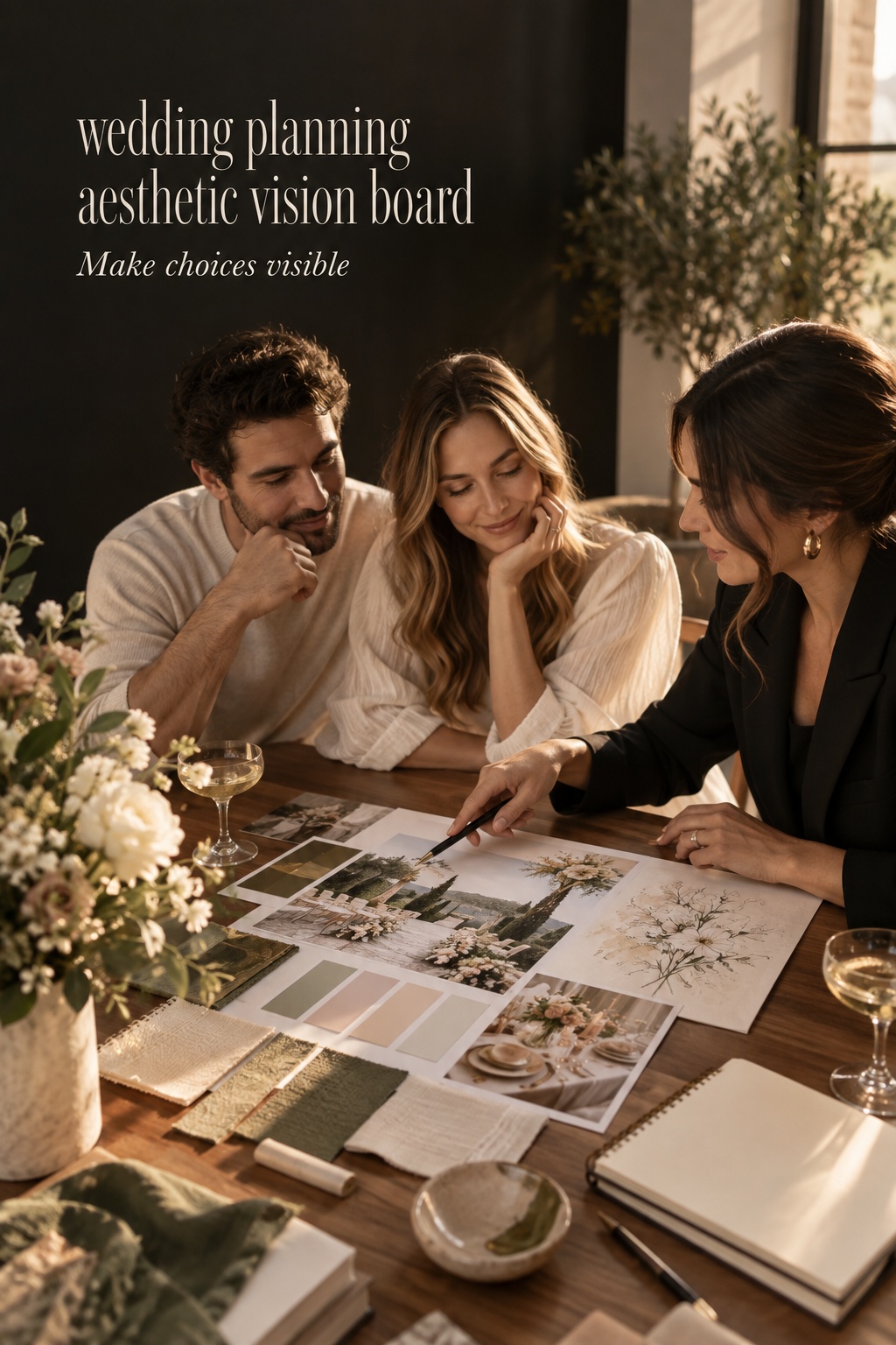
Turn visuals into a decision-ready design brief
Once the four layers are visible, add a small written brief beside the images. This is the part that makes your board practical. It does not need design-school language. It needs clear preferences that can survive a vendor call, a budget review, and an ordinary busy Tuesday.
- Overall feeling: Write your three feeling words and one sentence about the guest experience.
- Palette direction: Name the dominant colors, supporting colors, and what should remain neutral.
- Materials: List three to five textures or finishes that matter.
- Priority moments: Identify where you want to invest visual attention, such as ceremony, dinner, or entrance.
- Not for us: List the motifs, colors, or formality cues you want to avoid.
Next, turn each important image into one of three labels: inspiration, direction, or decision. Inspiration means you like the feeling but have not chosen an application. Direction means you want a vendor to propose options in that spirit. Decision means you have approved a specific choice, such as ivory stationery with a dark green type treatment or low, garden-style arrangements in bud vases. The labels prevent an old saved image from quietly turning into a commitment.
Give every decision an owner and a next step. “Florals: direction, ask florist for a proposal that uses movement and negative space.” “Lighting: decision, add warm table candles after venue confirms open-flame policy.” “Stationery: inspiration, collect three typography examples before meeting the designer.” This is a natural place for The Wedding Command Center or another shared planning home: use it to keep the board linked to active decisions, responsibilities, and questions instead of treating it as a separate piece of décor.
The written brief should be editable. Your venue may change. Your guest count may change. A wonderful floral proposal may reveal a detail you had not considered. The goal is not rigidity. It is to know which changes are thoughtful refinements and which changes pull the celebration away from what you actually want.
Use the board without letting it overrule reality
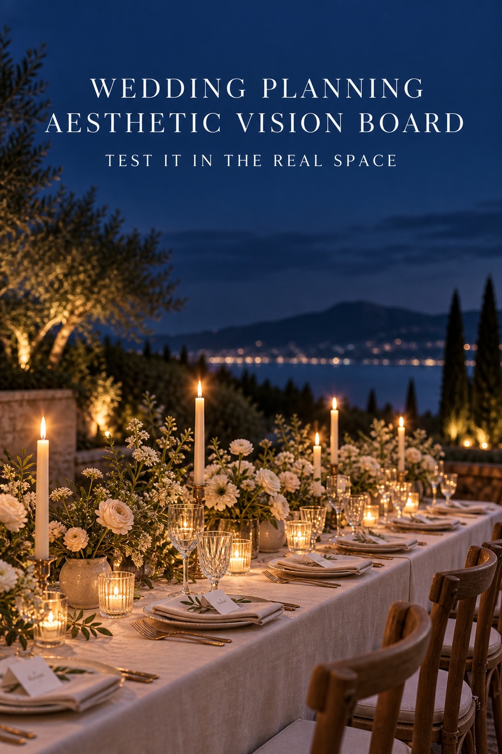
The fastest way to make a board frustrating is to treat every image as a requirement. Images are evidence of preference, not a shopping list. Before you carry a visual idea into a contract or purchase, run it through four checks: venue, budget, guest experience, and maintenance.
Venue comes first because architecture, light, restrictions, and logistics affect what will make sense. A mood board full of candlelit, low-ceiling dinner scenes may not translate to an afternoon tent reception. That does not mean you must abandon the mood. It means you may translate it through layered textiles, shaded seating, or a later transition into warmer lighting. Ask what the image is accomplishing, then find the venue-appropriate version of that effect.
Budget is not an aesthetic failure. It is a design parameter. If an image depends on hundreds of individual floral arrangements, identify whether the feeling comes from the flower count, the vessel, the color repetition, or the candlelight around it. Often you can preserve the essential visual language by choosing fewer but more intentional moments. Keep a priority list so that the elements you care about most receive attention before lower-impact extras.
Guest experience deserves equal weight. Consider sightlines, accessibility, comfort, noise, and movement. A ceremony setup should let people see and hear. A long dinner table should still let servers move comfortably. A dark dance floor may look dramatic in photographs but needs safe paths and usable signage. These are not compromises that dilute the aesthetic. They are choices that allow people to enjoy it.
Finally, think about maintenance. Ask who will set up, move, light, replenish, or remove the element. If the answer is unclear, the idea is not ready. The best visual choices are beautiful because they are well supported, not because someone tries to recreate a photo at the last minute.
How to share the board with each vendor
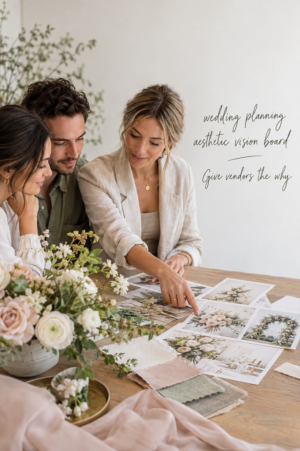
Do not send every vendor the same giant link and hope they find what matters. Give each person a focused view plus the short overall brief. Your florist needs images that explain color, scale, movement, and vase style. Your stationer needs typography, paper feel, formality, and the places where printed pieces will appear. Your rental company needs table shape, chairs, linens, glassware, and the density of the place setting. Your photographer needs the emotional pace, light, and moments you value most.
In each conversation, explain why you chose an image. “We like how open the center of this table feels,” is more useful than “We want this exact table.” “We love the soft contrast, but our room is darker,” gives a florist or planner room to solve the right problem. Vendors bring technical knowledge that a board cannot provide, so invite them to point out where a reference may not fit your conditions.
Bring the board to venue visits and ask practical questions. What lighting is included? Which surfaces can hold candles? What is already visually prominent? Where do guests enter? Which furniture must remain? Aesthetic planning becomes easier when you understand the space early, and it becomes less expensive when the design grows from what the venue already offers.
Set a review point after each major decision. Once the venue, floral direction, stationery, and rentals are moving, look at the board again. Remove references that no longer fit and mark the decisions that are final. A board should become quieter as the plan becomes clearer. That calm is a sign that it is doing its job.
Sources and methodology
This guide draws on wedding-planning resources that describe mood boards as a tool for clarifying a couple’s preferences and communicating with vendors. The process here adds a decision layer so that an aesthetic board connects to budget, venue, guest experience, and ownership. Useful starting references include Zola’s overview of wedding vision boards, Junebug Weddings’ advice on using inspiration, and WeddingWire’s discussion of inspiration overload.
FAQ
What should go on a wedding planning aesthetic vision board?
Include atmosphere, materials, guest experience, and a few execution examples. Add a short statement of the feeling you want, the colors and textures that repeat, your priority moments, and clear boundaries about what does not suit the celebration.
How many images should a wedding vision board have?
Use enough images to show the full experience, but few enough that a vendor can identify the pattern. A concise board is usually more useful than a large pin collection. Start broad, then edit until every remaining image has a job.
Should we make one board or separate boards for each vendor?
Make one master board for the overall aesthetic, then create focused views for florals, stationery, rentals, and photography. Each vendor should see the shared feeling plus the references that relate to their work.
When should we create our wedding aesthetic vision board?
Create it early, after you have discussed priorities and before you make many visual commitments. Refine it after the venue is confirmed, because the space, light, and restrictions will affect how the aesthetic translates.
What if we like different wedding styles?
Start with the feeling each of you wants guests to have, then identify the qualities you share. You do not need to merge every favorite image. Use the board to find a common visual language and allow each person a few meaningful details within it.
How do we keep a wedding board from becoming overwhelming?
Separate inspiration from approved decisions, label each important idea with a next step, and review the board at planned points rather than adding to it every day. If a new image does not support your feeling statement or solve a real planning question, leave it out.
Leave a Reply