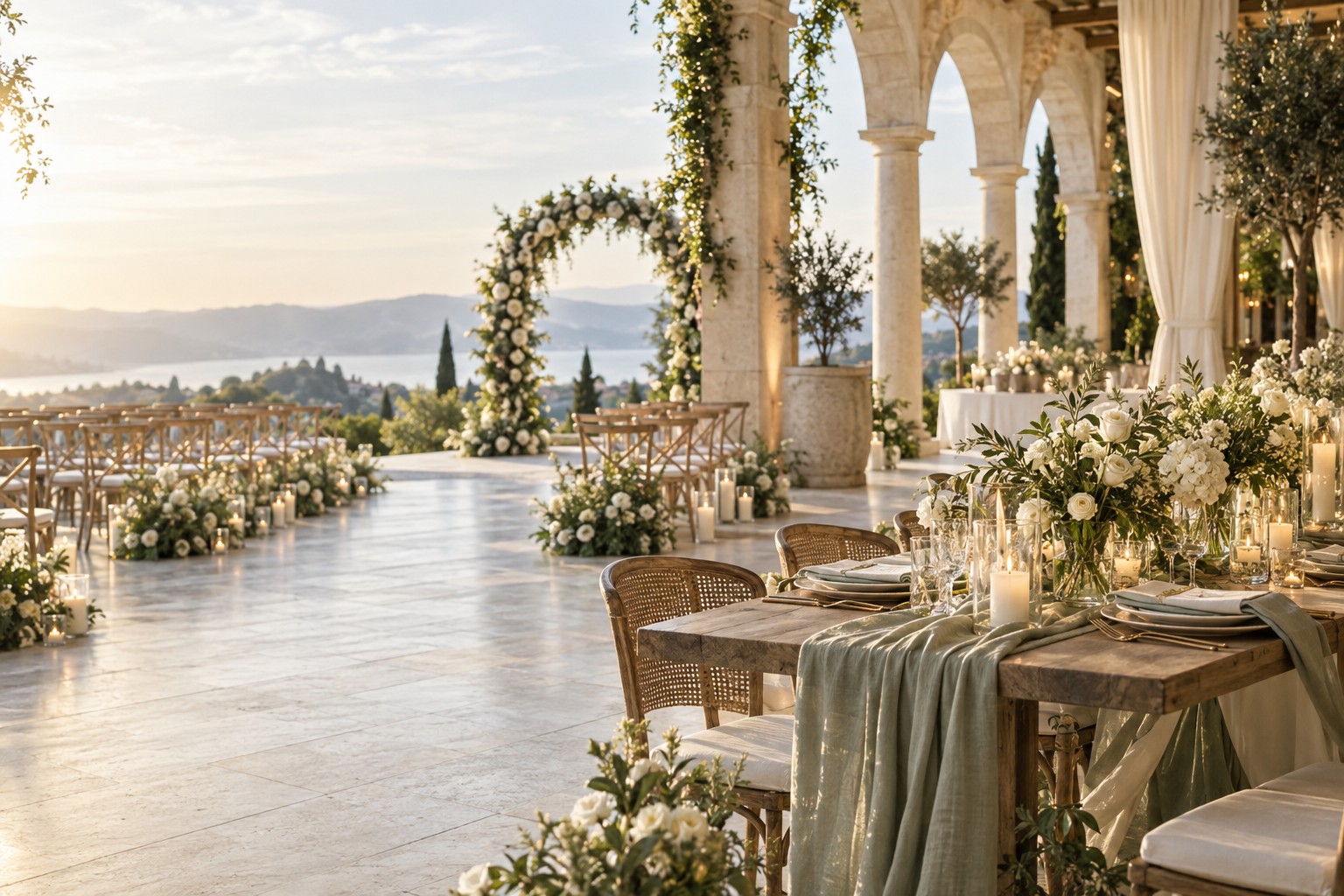
A wedding planning aesthetic is more useful than a collection of pretty pictures. It gives you a shared visual language for making decisions when the choices begin to multiply. Instead of asking whether every centerpiece, invitation, dress detail, or rental is beautiful on its own, you can ask whether it belongs to the atmosphere you are creating together.
The best aesthetic is not a rigid theme or a copy of a wedding you saved online. It is a practical description of how you want the day to feel, what you want guests to notice, and which visual details will make the celebration feel like yours. This guide walks through a simple process for turning that feeling into a usable plan for your venue, color palette, vendors, and budget.
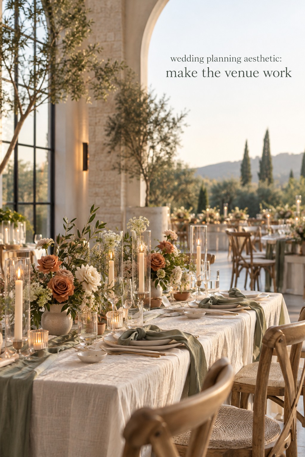
Start with the feeling, not the color palette
Color is often the first thing couples try to choose, but it is rarely the complete answer. A palette can be beautiful and still feel disconnected from the experience you want. Begin with three to five words that describe the emotional direction of the wedding. You might choose welcoming, candlelit, garden-inspired, relaxed, artful, modern, coastal, intimate, or celebratory. These words become a filter for every later decision.
Try completing this sentence: “We want our guests to feel…” Then write the first honest answers without editing them. Maybe you want guests to feel as if they have entered a warm dinner party, a quiet garden, a joyful family gathering, or a thoughtful gallery opening. This exercise moves the planning conversation away from trend names and toward an experience you can actually design.
Next, separate your words into three categories:
- Atmosphere: the emotional mood, such as relaxed, romantic, energetic, or intimate.
- Visual language: the shapes, colors, materials, and styling references that express that mood.
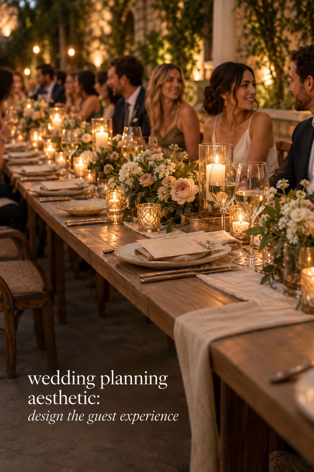
- Guest experience: the moments you want people to remember, such as a long dinner, dancing under lights, or a ceremony surrounded by flowers.
This distinction keeps the aesthetic from becoming surface decoration. If “warm and welcoming” is central, that may lead to a generous seating plan, comfortable lounge furniture, soft lighting, and a meal that encourages conversation. The same phrase may influence your stationery, your ceremony music, and the way your coordinator plans transitions. The aesthetic becomes a planning tool rather than a mood board that sits unused.
Choose one primary direction and two supporting qualities. For example, your primary direction might be modern garden, supported by intimate and slightly playful. This is more useful than listing ten styles at once. A focused aesthetic leaves room for personality while giving vendors enough information to make recommendations that feel related.
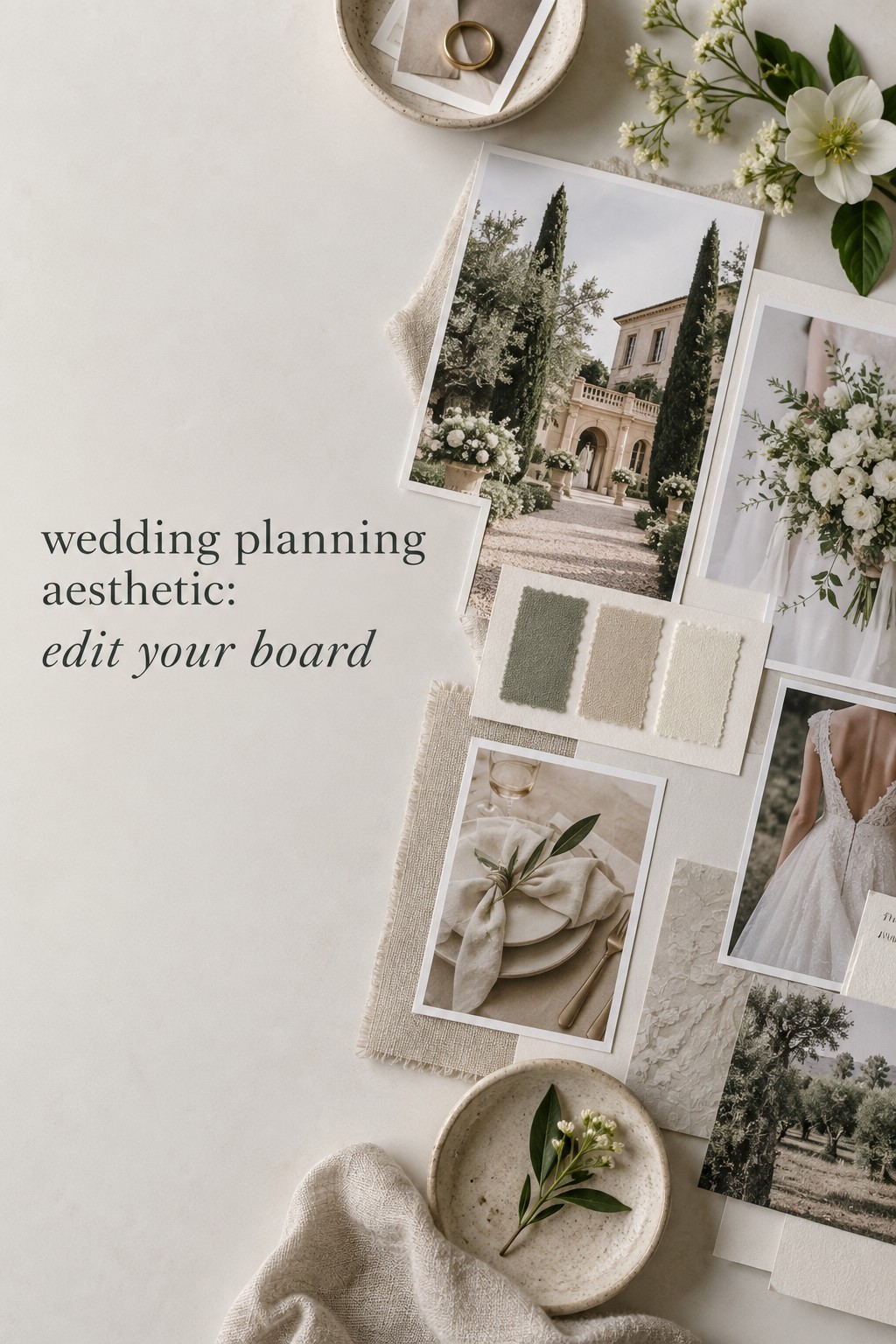
Build a focused wedding vision board
A vision board should show patterns, not every possibility. Start with a small collection of images that capture the atmosphere, then add references for the parts of the day that need practical decisions. Include the venue or a similar architectural setting, ceremony structure, tablescape, floral shape, attire, stationery, lighting, cake, and one or two guest-experience details. You can also include non-wedding references such as a landscape, painting, room, fabric, or restaurant that expresses the mood more accurately than a wedding photograph.
Use a two-stage process. In the first stage, collect freely for a limited amount of time. Save anything that creates a clear reaction, but avoid explaining every image. In the second stage, edit firmly. Remove images that only work because they show a different venue, season, budget level, or event size. A wedding planning aesthetic becomes clearer when you study what repeats across the remaining references.
Look for repeated visual signals
Count the details that appear more than once. Are you drawn to low, loose flowers or tall sculptural arrangements? Do you repeatedly save warm ivory, olive, and brown, or do you prefer clear white with saturated color? Are your favorite spaces full of texture, clean lines, vintage details, or open negative space? These repetitions are stronger evidence than a label such as “romantic” or “classic.”
Choose three to six recurring signals and write them in plain language. A useful list might be soft natural light, unstructured florals, creamy neutrals, handwritten details, long-table dining, and subtle vintage objects. This list is easy for a florist, planner, stationer, photographer, or rental company to understand.
Give the board boundaries
Decide how many images belong in the final board. There is no universal number, but a compact board is easier to share and remember than a feed that never ends. Give each part of the wedding a role, and remove duplicates that communicate the same idea. If five images all show the same bouquet, keep the one that best represents the shape, color, and scale you want.
Add short notes to clarify what you are borrowing from each image. Write “the candlelight,” “the relaxed spacing,” “the paper texture,” or “the contrast between the old building and modern tables.” Do not imply that the vendor should copy the entire photograph. Notes turn inspiration into direction while leaving room for professional interpretation.
A planning resource such as The Wedding Command Center can be useful at this stage when you need to keep visual decisions connected to tasks, conversations, and deadlines. The point is not to make the board more complicated. It is to give the aesthetic a practical home so it can guide the rest of the plan.
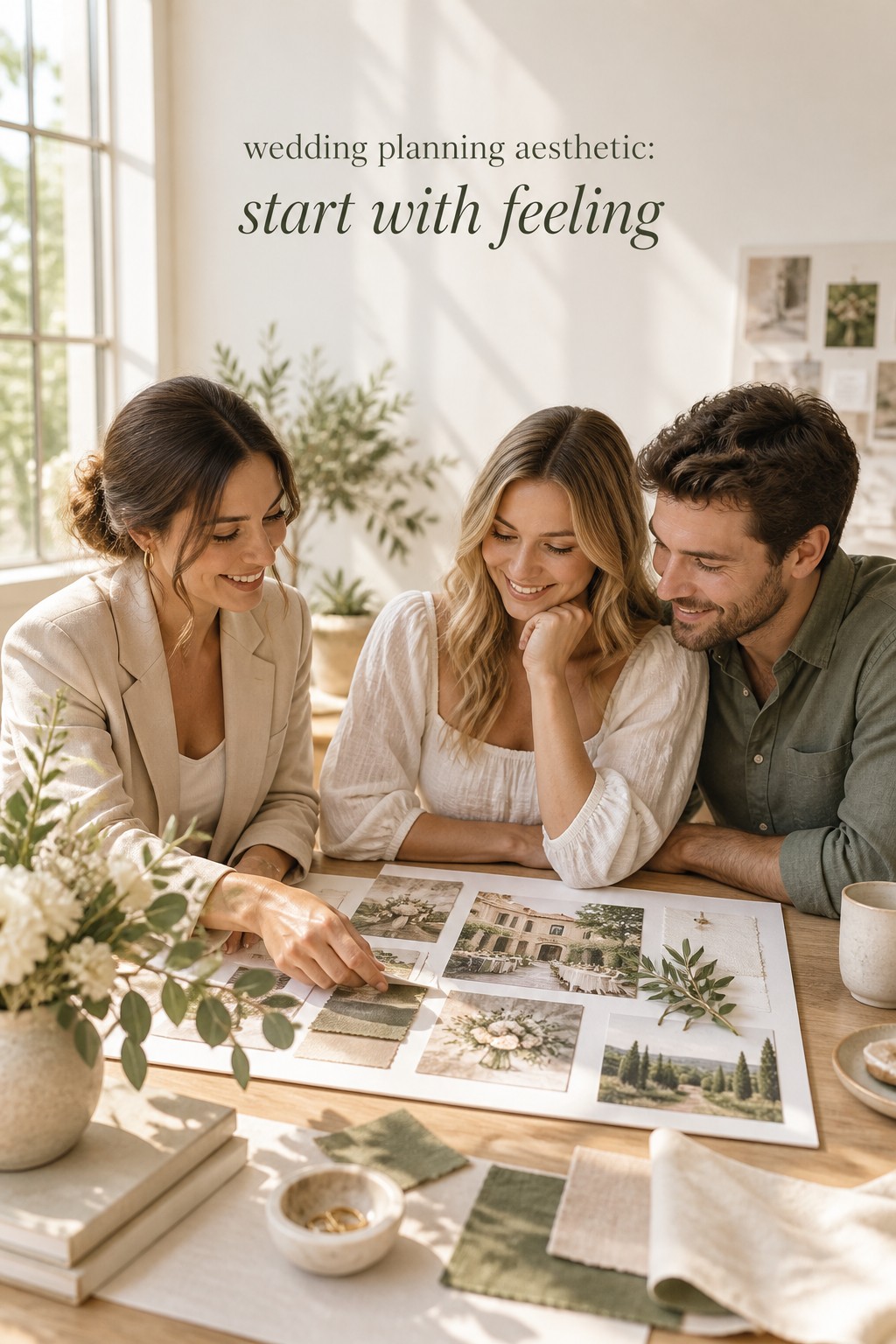
Translate the aesthetic into venue, palette, and materials
Your venue is part of the aesthetic whether you planned for it or not. Study its permanent colors, flooring, ceiling height, windows, light quality, architectural details, and existing furniture. Then decide whether your design should harmonize with those elements, create contrast, or visually soften them. A bright historic room may support saturated flowers and darker wood, while a modern white space may need warm textiles, layered lighting, or organic shapes to keep it from feeling stark.
Photograph the venue at the time of day when your event will happen. Look at the images without filters and note where the eye naturally travels. This helps you place the strongest design moments where they will be visible. A beautiful ceremony installation may disappear against a dramatic background, while a simple arrangement may be enough when the architecture already carries the scene.
Choose a layered palette
A useful wedding palette often has a foundation, a supporting family, and a restrained accent. The foundation may come from the venue or from a neutral you genuinely like. Supporting colors can appear in flowers, linens, paper, attire, or small objects. The accent should be used intentionally rather than scattered everywhere. You do not need to assign every color to every category.
- Foundation: the largest visual fields, such as ivory, sand, stone, soft green, or a venue color.
- Supporting tones: colors that create depth across florals, textiles, stationery, and attire.
- Accent: a smaller note that adds definition, such as black ink, brass, berry, blue, or a warm metallic.
Test the palette in materials, not only digital swatches. Colors change on paper, linen, velvet, ceramic, and flowers. Ask your florist what is locally available in the season, and ask your rental company which linens and tabletop pieces exist in your price range. A palette that works beautifully on a screen may feel flat when all of its colors have the same finish.
Repeat materials with restraint
Materials can make an aesthetic feel consistent without making it look themed. If texture is important, repeat two or three materials, such as linen, handmade paper, wood, glass, stone, or brushed metal. Use them at different scales. A paper texture might appear in invitations, place cards, and menus, while wood might be limited to signage and a bar detail.
Think about contrast as carefully as repetition. Smooth stationery with loose florals creates one kind of mood. Rough paper, clean typography, and structured flowers create another. If every surface is equally ornate, the eye has nowhere to rest. Leave some quiet areas so the important moments feel intentional.
Let the season influence the translation without dictating it. A summer wedding does not have to be bright, and a winter wedding does not have to be dark. Season can guide flower availability, light, fabric weight, and food, while your main words keep the visual direction personal.
Make the aesthetic usable for vendors and budget decisions
Aesthetic decisions become much easier when you rank them. Create three lists: non-negotiables, strong preferences, and flexible details. Non-negotiables might include warm candlelight, a long dinner, a specific floral feeling, or a venue view that must remain visible. Strong preferences could include a certain paper stock, lounge seating, or a color family. Flexible details are elements you can change when availability or budget calls for it.
Then assign an emotional value to each major design category. Ask which choices will most affect how the day feels in person and in photographs. Often, lighting, layout, ceremony backdrop, guest comfort, and the scale of the floral plan matter more than small favors or a long list of decorative objects. This ranking helps you spend where the aesthetic will actually be experienced.
Create a one-page vendor brief
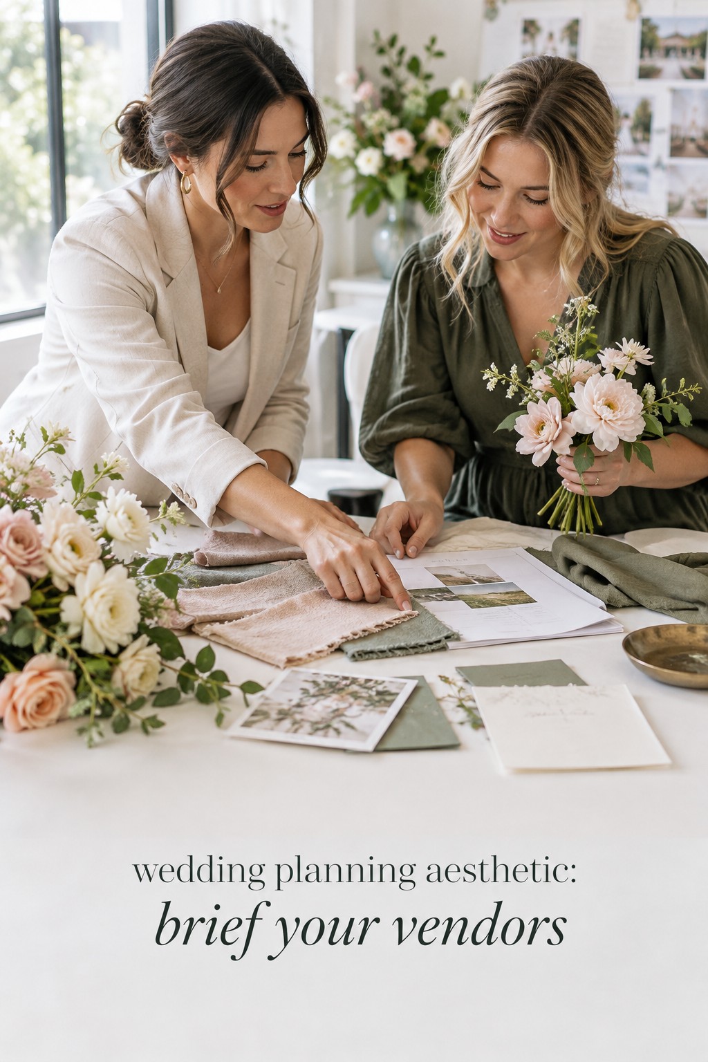
Before sending a large folder of inspiration, make a one-page summary. Put the primary aesthetic phrase at the top, followed by three mood words, the palette, recurring materials, and the guest experience you want to prioritize. Add a short “please avoid” section. For example, you may want to avoid overly symmetrical arrangements, bright white uplighting, rustic props, or anything that blocks conversation across the table.
- One sentence describing the feeling of the day.
- Three to six visual signals that should repeat.
- A palette with practical material notes.
- Two or three non-negotiables.
- A short list of details that are flexible.
- Selected images with notes explaining what each image contributes.
Ask each vendor to reflect the brief back in their proposal. You are not testing whether they use the same vocabulary. You are checking whether they understand the priorities. A florist may translate “airy and garden-inspired” into movement and seasonal flowers, while a stationer may translate it into paper texture and generous spacing. Good collaboration allows different vendors to interpret the same direction without making the wedding look disconnected.
Use a decision test when new ideas appear
New ideas will keep arriving after the board is finished. Before adding one, ask four questions: Does it support the emotional goal? Does it work with the venue? Does it repeat or thoughtfully contrast an existing signal? Is it worth the budget, time, or complexity it introduces? If the answer is no to most of these, save the idea in a separate inspiration folder rather than changing the whole direction.
Do not confuse consistency with sameness. A wedding can have a restrained palette and still include a playful cake, an unexpected song, colorful shoes, or a sentimental object. Personal details are strongest when they are chosen because they matter to you, not because they match every other item.
Common wedding planning aesthetic mistakes to avoid
The first mistake is choosing a label before understanding the feeling. Words like timeless, boho, modern, or romantic can be useful starting points, but they mean different things to different people. Translate the label into specific evidence: colors, shapes, materials, lighting, and guest moments. The second mistake is building the aesthetic around one photograph. A single image may show a perfect venue, season, or budget that cannot be reproduced. Look for a pattern across references instead.
Another common problem is asking the palette to do all the work. Color cannot fix a layout that makes conversation difficult or lighting that feels harsh. Plan the experience first, then use visual choices to support it. Also watch for too many competing priorities. If you want a formal ceremony, a relaxed dinner, a colorful party, a minimalist room, and a vintage garden all at once, decide which feeling leads and which ones become supporting notes.
Finally, avoid changing direction every time you see a new trend. A wedding planning aesthetic should make decisions calmer over time. Review your brief when you are unsure, compare the new idea with your priorities, and keep the elements that feel meaningful. The goal is a celebration with a recognizable point of view, not a performance of perfect visual consistency.
FAQ
What is a wedding planning aesthetic?
A wedding planning aesthetic is the connected visual and emotional direction for your celebration. It includes the atmosphere you want guests to feel, plus the colors, materials, shapes, lighting, venue cues, and details that support that experience. It is broader than a theme and more useful than a list of trends.
When should we choose our wedding aesthetic?
Begin exploring it before making many design commitments, then refine it after you understand your venue, season, guest count, and budget. You do not need a finished board before booking a venue, but the venue should become part of the final direction rather than an afterthought.
How many colors should a wedding palette include?
There is no required number, but a foundation, two or three supporting tones, and one accent is a practical place to start. Test colors in real materials and decide where each one appears. A palette feels cohesive because of proportion and repetition, not because every item contains every color.
How do we keep a vision board from becoming overwhelming?
Collect freely first, then edit to remove duplicates, incompatible settings, and images that only appeal because of a different budget or season. Keep the final board compact, group references by purpose, and add notes that explain the specific detail you want to carry forward.
How do we explain our aesthetic to wedding vendors?
Share a one-page brief with your primary direction, mood words, visual signals, palette, non-negotiables, flexible details, and selected images. Explain what you like about each image rather than asking a vendor to recreate it. This gives professionals enough direction to interpret the aesthetic for their specialty.
Can our wedding aesthetic include more than one style?
Yes. Choose one leading feeling and let other styles support it. For example, a modern garden wedding can include vintage stationery or a playful cake if those details reinforce the main experience. Limiting the number of competing priorities helps the combination feel intentional rather than accidental.
Leave a Reply